Bathroom Remodeling Website Design That Wins Clients in 2025
Most bathroom remodeling contractors lose leads before anyone picks up the phone. The prospect searched, clicked, landed on the site, and left, not because the contractor does bad work, but because the website didn’t convince them to stay. Bathroom remodeling website design isn’t about looking slick. It’s about removing every reason a homeowner has to click back and call the next company instead.
The gap between a site that converts and one that just exists is narrower than most contractors think. It’s usually three or four specific things done right, not a complete overhaul of your digital presence. The same principles apply whether you specialize in bathrooms, kitchens, or full-home remodeling. But bathroom remodelers have an advantage: a tight niche makes it easier to build a focused site that speaks directly to what homeowners are searching for.
What Homeowners Actually Look for on a Remodeler’s Website
A homeowner comparing three bathroom remodelers side by side is not reading your About page. They’re scanning. They’re making a gut-level judgment about whether your company is professional, established, and trustworthy, and they’re making it in under ten seconds based almost entirely on how the site looks and how easy it is to find what they need.
You might have twenty years of experience and a flawless reputation on Google, but if your website looks like it was built in 2014, you’re losing to the competitor who launched a clean site last year with half your track record. Homeowners judge professionalism by design quality. That’s not fair, but it’s how the decision works.
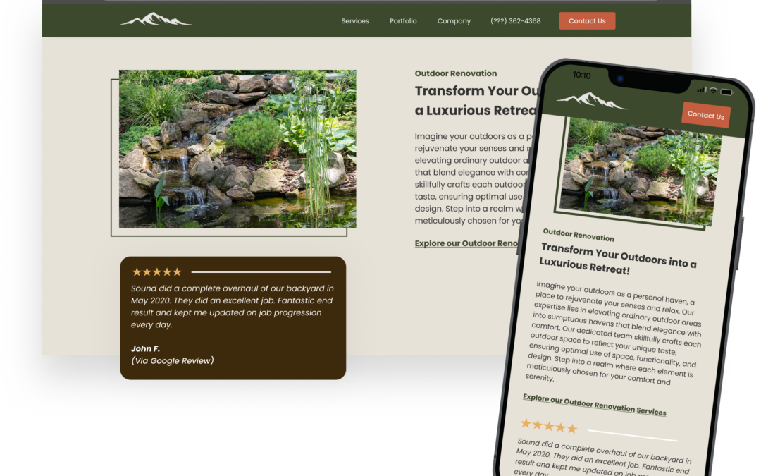
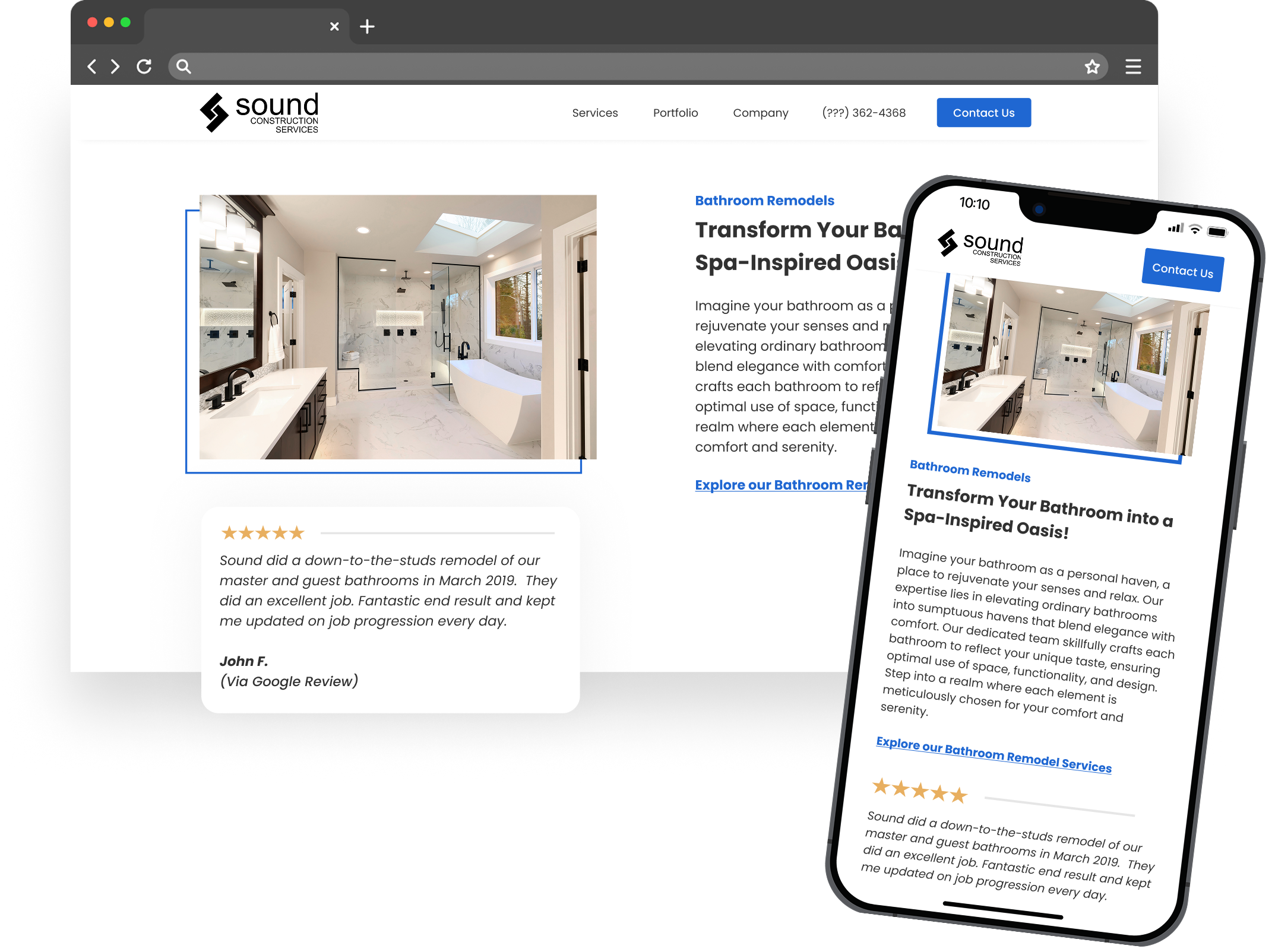
- Portfolio quality. Do you show real photos of real bathrooms you’ve remodeled? Are they well-lit, clearly before and after, and organized in a way that’s easy to browse? If the first thing a visitor sees is a stock photo of a bathroom you didn’t build, you’ve already lost credibility.
- Service area clarity. Homeowners want to know immediately whether you work in their area. If they have to dig for that information, many won’t bother.
- Contact accessibility. A phone number in the header, a short form above the fold, a sticky button on mobile. If a homeowner has to scroll to the footer and hunt for a way to reach you, you’re making them work too hard at the exact moment they’re deciding whether to call.
The best construction website designs share these traits: prominent galleries, specific service pages, visible reviews placed where they reinforce the decision to reach out. An alarming number of remodeling websites bury their strongest selling points three clicks deep.
Showcasing Your Work: Project Galleries That Sell
Your visual portfolio is doing more selling than your copy. For bathroom remodelers, before-and-after photo galleries are the single most persuasive element on the entire site. A homeowner looking at a dated bathroom that looks like theirs, next to the finished result you delivered, that’s the moment they start imagining their own project. No amount of text about your process or your values creates that same emotional response.
Most remodeling galleries are set up wrong. The typical approach is a single page with every project photo dumped into a grid: thirty, forty, sixty images with no organization. The homeowner scrolls for a while, gets overwhelmed, and leaves without finding the project type that’s relevant to them.
Organize galleries by project type. Master bathroom remodels, small bathroom renovations, walk-in shower conversions, tub-to-shower replacements, accessibility-focused builds. Each category gets its own page or clearly defined section. A homeowner looking for a small guest bath renovation shouldn’t have to scroll past twelve luxury master suites to find something that matches their scope and budget.
Each project should include a brief description, not a novel, just two or three sentences covering the scope of work, any specific challenges you solved, and the key materials or fixtures used. This gives the homeowner context that makes the photos more meaningful and creates natural SEO content. Every project write-up is an opportunity to include specific terms homeowners actually search for, which helps individual project pages rank for long-tail keywords over time.
For high-end remodelers targeting larger projects, virtual reality tours of completed remodeling spaces are starting to appear as a differentiator. This isn’t necessary for most contractors, and the production cost only makes sense if your average project value justifies it. But if you’re competing for $80K+ master bath renovations, an immersive 3D walkthrough of a finished space sets you apart from every competitor showing flat photos.
Include a CTA, not buried at the bottom, but integrated naturally after every few projects. Something as simple as “Want to see what we can do with your bathroom? Request a free consultation.”
Photo Quality Is Non-Negotiable
Phone photos taken during cleanup with tools still on the counter and uneven lighting will actively hurt your credibility. You don’t need a professional photographer for every project, but you need consistent, well-lit images taken after the space is clean and staged. Even basic staging, fresh towels, a plant, the lights on, makes a dramatic difference in how the work is perceived. Contractors who invest a few hundred dollars in a photographer for their top five projects get more mileage from those images than from thousands spent on ad copy.
WordPress vs. Wix vs. Squarespace for Remodeling Contractors
This decision matters less than most contractors think, and more than most web designers admit. The platform you build on determines what you can do with the site a year from now, not just how it looks on launch day.
WordPress is the strongest choice for remodelers who are serious about lead generation and plan to invest in content marketing or local SEO over time. It’s the most flexible platform, has the best SEO infrastructure, and scales without hitting walls. The tradeoff is maintenance: plugin updates, security monitoring, and occasional technical attention. If you’re working with a marketing team or agency, this is almost always the right call. If you’re managing the site yourself with no technical comfort, the maintenance overhead is real.
Squarespace produces beautiful portfolio-heavy sites out of the box. For a bathroom remodeler who primarily needs a clean gallery, clear service information, and a contact form, it can work. The limitations show up when you want deeper SEO control, custom integrations, or dozens of location-specific pages.
Wix has the lowest barrier to entry, but its SEO capabilities are weaker, site speed can suffer with image-heavy galleries, and migrating away from Wix later is painful. If you start on Wix and later decide you need a serious lead-generation site, you’re essentially starting over.
For a contractor who views the website as a long-term asset, something that generates leads consistently and grows in value, WordPress is the clear winner. Wix and Squarespace work for a simple online presence, but they create ceilings you’ll hit faster than you expect.
Mobile-First Design Is the Baseline, Not a Feature
More than half of remodeling searches happen on phones. A site that loads slowly on mobile or requires pinching and zooming to navigate is invisible to the majority of your potential clients. This isn’t a design preference. It’s a conversion optimization issue with direct revenue consequences.
- Page speed: Test your site with Google’s PageSpeed Insights. If your mobile load time exceeds three seconds, you’re losing visitors before they see a single photo. Compressed images, minimal scripts, and proper hosting solve most speed problems. Page speed optimization also affects your Google rankings directly.
- Tap-friendly navigation: Buttons need to be large enough to tap accurately. Forms need to be short enough to fill out on a phone screen. A sticky contact button that follows the user as they scroll is one of the highest-impact conversion elements you can add.
- Image handling: Your gallery is the heaviest part of the site. Serve appropriately sized images for mobile rather than loading the same high-resolution files you display on desktop. This single change can cut mobile load times in half.
Construction Company Website Patterns Worth Stealing
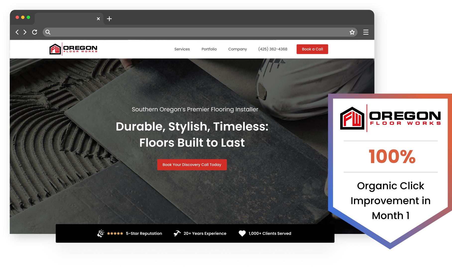
Clean hero sections with a single call to action. Not three buttons competing for attention. Not a rotating slider with five different messages. One strong headline that communicates what you do and where, one supporting line, and one button.
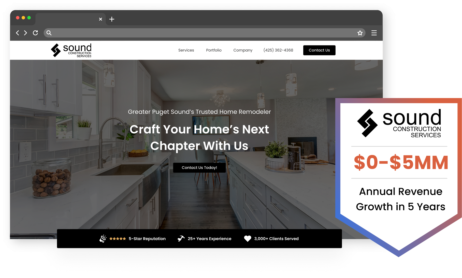
Service-area specificity matters more than most contractors realize. A homepage that says “Serving the greater Phoenix area” performs differently than one that lists the specific cities and neighborhoods you work in. Local SEO depends on this specificity, and homeowners respond to it. Seeing their town name on your site creates an immediate sense of relevance.
Social proof above the fold: a star rating pulled from Google, a count of completed projects, or a single strong testimonial line placed near the top of the homepage. Visitors shouldn’t have to navigate to a separate reviews page to see that other people trust you.
The worst sites share the same mistakes: cluttered homepages trying to cover every service on one screen, stock photography instead of real project photos, contact forms buried at the bottom of interior pages, and website navigation so complex that a homeowner can’t figure out where to go. Your niche focus as a bathroom remodeler is an advantage here. You don’t need twelve service categories. Design the site around bathroom-specific content and let that focus build credibility.
Integrating Reviews and Customer Testimonials
A standalone testimonials page that nobody visits is a wasted asset. Place customer testimonials on your service pages and directly adjacent to your CTAs, the moments where a homeowner is closest to reaching out. A review from a past client sitting right next to the “Request a Quote” button does more work than twenty reviews on a page the visitor never finds.
Embed your actual Google reviews. They reinforce authenticity in a way that manually typed quotes can’t. Video testimonials from past bathroom remodel clients outperform text significantly, though even a short written review with a first name and city carries weight when placed strategically.
Making Your Bathroom Remodeling Website Easy to Find
Create individual pages for each service you offer. A page for walk-in shower installations, a page for tub-to-shower conversions, a page for full bathroom remodels, a page for accessibility modifications. Each page targets different search terms and gives Google a clear signal about what you do. A single “Services” page that lists everything in bullet points is dramatically weaker than dedicated pages with unique content, relevant photos, and specific descriptions.
Your Google Business Profile is the foundation of local SEO for any remodeling contractor. Keep it current, ensure your name, address, and phone number are consistent across every directory and listing, and actively request reviews from completed projects. NAP inconsistency, where your business name or address varies slightly across different sites, quietly undermines your local rankings.
Every completed bathroom remodel can become a case study page. Write up the project scope, the homeowner’s goals, the challenges you navigated, and the outcome. Include the neighborhood or city name. These pages rank for long-tail keywords that generic service pages never capture. Over time, a library of project pages builds organic visibility that compounds.
Write for the homeowner, not for the search engine. Pages stuffed with keywords read poorly and don’t convert. A project description that naturally mentions the service, location, and scope will rank without reading like it was written by a bot. User engagement metrics, how long someone stays on the page, whether they click through to your contact form, affect rankings too. Content that’s genuinely useful to a homeowner evaluating remodelers performs better on every axis.
Personalization and Accessibility
Personalized website experiences using automation tools, showing different content to returning visitors, tailoring CTAs based on the page someone entered from, are gaining traction among remodelers with higher traffic volumes. ADA-compliant websites aren’t just a legal consideration; they also tend to be better-structured sites that perform well in search. Screen-reader-friendly navigation, proper heading hierarchy, and sufficient color contrast overlap heavily with good design fundamentals.
IMPACT Digital builds websites for remodeling contractors around this exact approach: service-specific pages, project galleries structured for conversion, and SEO infrastructure that turns a site into a lead-generation asset instead of a digital business card. If your current site isn’t generating the inquiries your work deserves, we should talk.